Eduroam Redesign
In conjunction with the course “Human-computer interaction”, this project created a redesign suggestion towards how the guide for setting up the network Eduroam at Umeå University should look, function and interact with the user. The focus was on good design according the established design principles from Donald Norman and Jakob Nielsen.
As the current guide and process for setting up the Eduroam network at Umeå University is frankly ridiculously convoluted and has a reputation to be complicated, we decided to create a new design suggestion how such a setup process could be improved, with better design. A lot focus went into user testing and design analyzing, to see why the current implementation and design fails for the users. A prototype also was created to see how the new redesign may be implemented and expand the mockup to accommodate the whole process. Eduroam Redesign protype
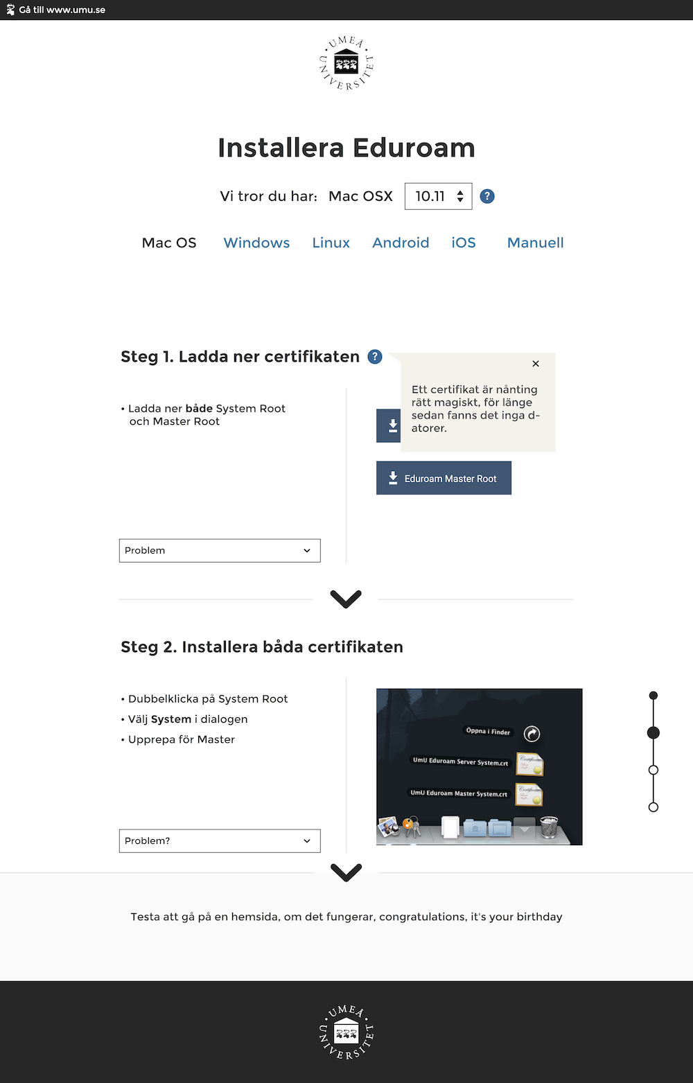
Below is the mockup for the new design 
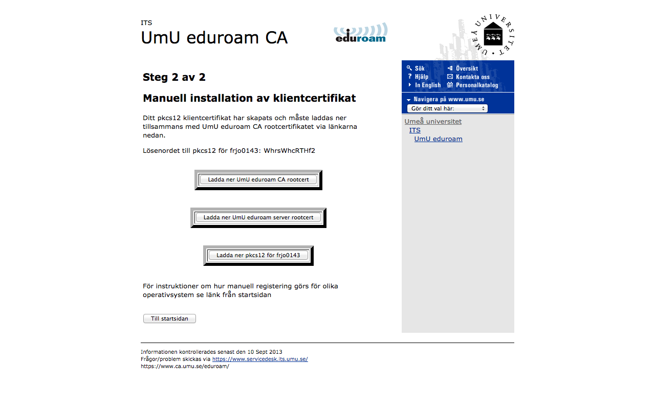
As a comparison, the two images below show how the old (and current) guide describes the process to the user. I leave it up to the reader to figure out what one should actually do, as that is what the guide expects from the user.
Below is the old version 
Below is the old version 