Symbolism vs Text
This was an examination of how people experience and performed with website in pure symbolism or pure text. The research was part of the course “Architecture of Mind for Interaction and Design” where the assignment was to perform some experiment within the field of cognition.
The group that I was working on decided it would be fitting to choose an experiment that we, as interaction designers, could actually learn from. And the experiment was: design two website with equal content and layout, only difference would be that one website would only include symbols, images, forms and colors, while the other one would only include text.
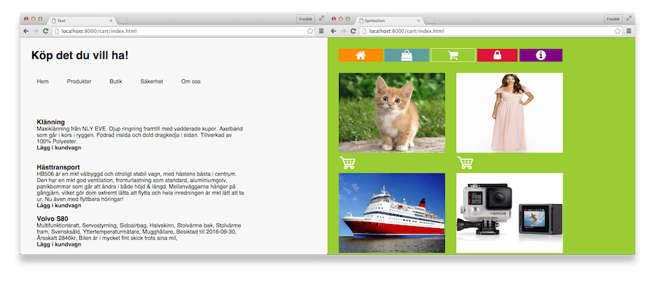
The users would perform a series of assignments with the goal to navigation the website, and later answer a survey about their experience. The result was both surprising and interesting, the users were slightly faster on the website with images and symbols, though they thought they had a worse experience navigating it as they often questioned themselves about what the symbols meant.
The lesson to learn from this experiment is that symbols and images are fast to scan but is not as clear and reassuring as text can be.